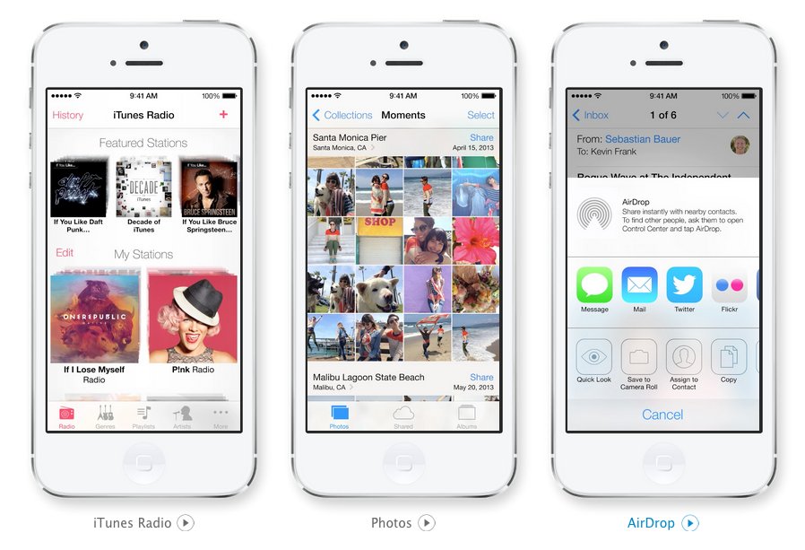
Apple's new iPhone and iPad operating system iOS 7 has come in for a lot of heated criticism - amid similar levels of praise - since it was unveiled and released to developers last month.
But it's clear that Apple is a long way from finished.
In the second version of the software the Californian computer giant made a raft of significant changes to the beta shown off at WWDC in June.
And now the third beta version is out - and they're at it again.
Most obviously Apple has changed the font in iOS 7 from Helvetica Neue Light to Regular.
It might sound like a small change -- but it's one that designers have welcomed with open arms. Below is a comparison Gif by Panic Software's Cabel Maxfield Sasser:

He said:
"With Ive's new role leading UI design, I was afraid that we were in for a long series of such failures. And with iOS 7 being unveiled so publicly and confidently, I really didn't think any decisions as significant as the system font would change before release. Now, we know otherwise."
Of course it's still possible that the font could change back - but it does look like Apple is listening.
"All betas are works in progress, but iOS 7 is far more so than usual. They're still playing with this stuff," said John Gruber at Daring Fireball.
Now, about those icons...


No comments:
Post a Comment